In the March/April issue of Mother Jones there appears a series of charts under the heading It's the Inequality, Stupid, that go hand-in-hand with my post from last July, The Land of Greatly Diminished Opportunity. (Please be sure to check out both articles. In particular, there are extensive illustrations in the latter that do not appear below.) Taken together, they provide a shocking picture of America as plutocracy, with enormous - and growing - wealth gaps between a very small class of the extremely rich and the rest of the work force not seen since the Gilded Age, ever-higher barriers to class mobility, and average hourly earnings that have only recently climbed back to where they were at the end of the Carter Administration.

This is, bluntly, bad for the country. The U.S. economy is driven by consumer spending, and the less disposable income available among the masses, the less that will be produced to meet shrinking demand. Likewise, these are the type of conditions that create and foment social unrest, and as the extreme political right seeks to put the capstone on their efforts to destroy the American labor movement, we are seeing the first signs of broad, popular resistance to the massive, sustained, three-decade flow of wealth from the bottom of the economic pyramid to the top.
This is not an issue of favoring socialism over capitalism; as with most things, it is a question of balance. There is an equilibrium that rewards the innovative, the hard-working and the industrious while still providing opportunity to the poor, the disenfranchised and the weakest among us, and that equilibrium does not exist today. It is in the best interest of the wealthy, who have more to loose, to promote that kind of harmony, and to recognize the benefits of not only a stable society, but a robust market for the goods and services many of them help produce. If we have not yet reached a tipping point, we are close to doing so.
Below are the charts from the Mother Jones article It's the Inequality, Stupid.
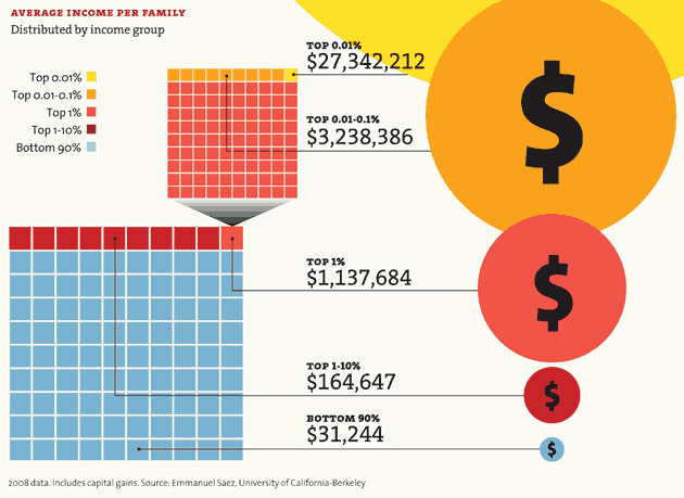
How Rich Are the Super-Rich?
A huge share of the nation's economic growth over the past 30 years has gone to the top one-hundredth of one percent, who now make an average of $27 million per household. The average income for the bottom 90 percent of us? $31,244.
This is not an issue of favoring socialism over capitalism; as with most things, it is a question of balance. There is an equilibrium that rewards the innovative, the hard-working and the industrious while still providing opportunity to the poor, the disenfranchised and the weakest among us, and that equilibrium does not exist today. It is in the best interest of the wealthy, who have more to loose, to promote that kind of harmony, and to recognize the benefits of not only a stable society, but a robust market for the goods and services many of them help produce. If we have not yet reached a tipping point, we are close to doing so.
Below are the charts from the Mother Jones article It's the Inequality, Stupid.
How Rich Are the Super-Rich?
A huge share of the nation's economic growth over the past 30 years has gone to the top one-hundredth of one percent, who now make an average of $27 million per household. The average income for the bottom 90 percent of us? $31,244.

Winners Take All
The super-rich have grabbed the bulk of the past three decades' gains.

Out of Balance
A Harvard business professor and a behavioral economist recently asked more than 5,000 Americans how they thought wealth is distributed in the United States. Most thought that it’s more balanced than it actually is. Asked to choose their ideal distribution of wealth, 92% picked one that was even more equitable.

Capitol Gain
Why Washington is closer to Wall Street than Main Street.

| member | max. est. net worth |
|---|---|
| Rep. Darrell Issa (R-Calif.) | $451.1 million |
| Rep. Jane Harman (D-Calif.) | $435.4 million |
| Rep. Vern Buchanan (R-Fla.) | $366.2 million |
| Sen. John Kerry (D-Mass.) | $294.9 million |
| Rep. Jared Polis (D-Colo.) | $285.1 million |
| Sen. Mark Warner (D-Va.) | $283.1 million |
| Sen. Herb Kohl (D-Wisc.) | $231.2 million |
| Rep. Michael McCaul (R-Texas) | $201.5 million |
| Sen. Jay Rockefeller (D-W.Va.) | $136.2 million |
| Sen. Dianne Feinstein (D-Calif.) | $108.1 million |
| combined net worth: | $2.8 billion |


Who's Winning?
For a healthy few, it's getting better all the time.


Your Loss, Their Gain
How much income have you given up for the top 1 percent?

No comments:
Post a Comment